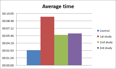
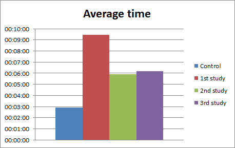
I was trying to make Microsoft Excel display sharp times on graphs, but took me a while to figure out how to. I had this graph of time to complete the task, per group of participants. The X axis displayed the participant group, and the Y axis corresponded to time. But as you can see on the example, instead of showing rounded times like 2, 5 or 10 minutes, Excel was showing fractions like 01:26, 2:53 etc. I would prefer having a scale with sharp times, for aesthetic purposes and also to make it easier to understand and compare. Supposing I have these values, the graph automatically generated by Excel, with default settings, is below:
| Control | 1st study | 2nd study | 3rd study |
|---|---|---|---|
| 00:02:55 | 00:09:26 | 00:05:55 | 00:06:10 |

Experienced Excel users know that if you double click that axis you can enter it’s minimum, maximum and intermediate values. But adding the time data like 00:00:00, 00:00:10 doesn’t help. I had to understand how Excel deals with time to enter the right values there. As explained on a forum, Excel handles time as fractions of one day.
1 = 1 Day
1/24 = 0.041666667 = 1 Hour
1/24/60 = 0.000694444 = 1 Minute
So, instead of inserting like 00:00:01 on the axis options fields, you have to insert 0.000694444. If you want your major subdivisions of the axis be at every 2 minutes, then add 0.001388889 to the major unit field.
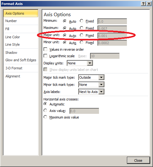
To change the scales on your axis, double click (or right click) on the axis or values you want to format, and the ‘Format axis’ window will pop up.
Usually, setting only the ‘Major unit’ is enough to improve your graph axis. On the right pane select ‘Fixed’ to be able to change the values, and paste the fraction of time that suits your data. In my case, 1 minute lines looked better on the graph.

Then the final result is a scale with rounded numbers which are more suitable for humans, since sharp times make it easier to understand and compare.


